
MINDFUL DRAWING TUTORIAL:SHADOW
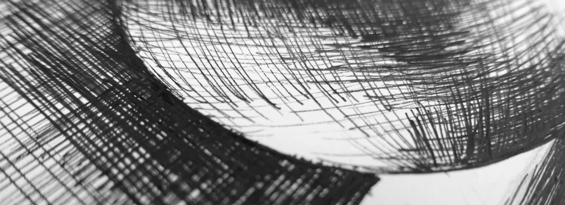
I often get a lot of questions from students about how to create shading in ink. Cross hatching can feel quite overwhelming when you are a beginner - where to put it, which direction it should be going in, and how to approach layering up a drawing from start to finish, using hatching effectively to represent shadow, are all things which can feel complicated when learning to draw, so I wanted to approach the final prompt for #mindfultober2023 (Shadow) in a tutorial which might help to answer some of these questions.
This tutorial can also be found as a real-time draw with me style tutorial on YouTube, so if you prefer to digest this in video format, be sure to hop on over there!
SUPPLIES
To follow along, you will need:
paper
a pencil
an eraser
a pen
something circular to draw around or a compass
If you would like to work from the same photo reference as me, you can find that here
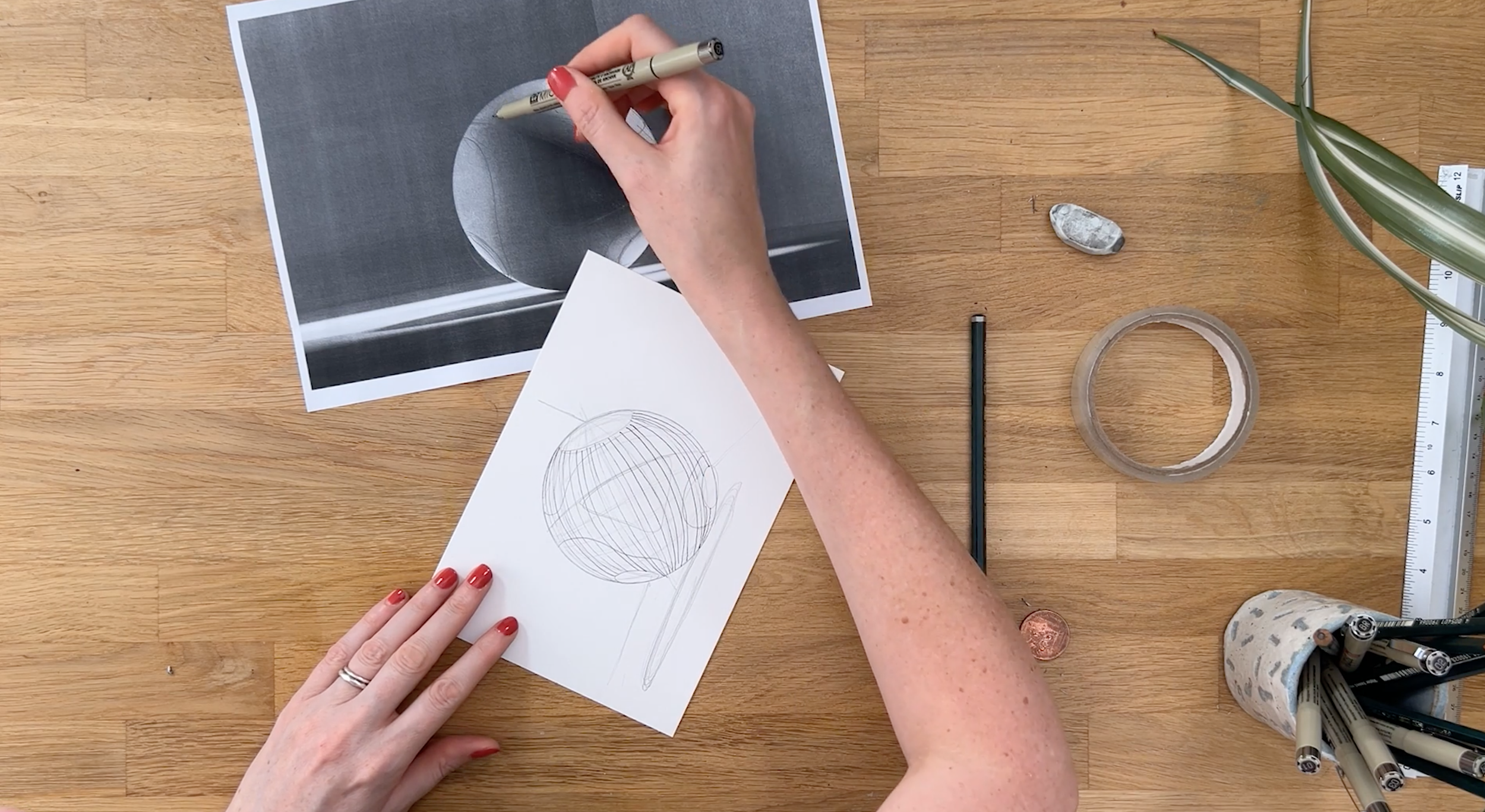
STEP 1: DRAW OUT A CIRCLE IN PENCIL
To help us get a nice even circular shape for the ball, first draw a circle in pencil on your paper either by using a compass, or by drawing around a circular object (like a roll of tape for example).
TIP: Decide whether to use your paper in landscape or portrait orientation - you need to have enough space to be able to shade the ball, and the shadow underneath.
STEP 2: OBSERVE YOUR REFERENCE
We need to really take a close and objective look at our reference image. One of the big challenges with drawing from an image like this, is that it is so simple that our brain thinks it knows it and fills in the gaps for us before we’ve really had the opportunity to really look. So before we begin, I want you to spend some time just looking at this reference photo without drawing anything, and it can actually help to turn it upside down because it can help our brain to switch off from it’s ‘know-it-all’ mode and allow us to look for the shapes of shadows and highlights.
What we are looking for are the shapes of the areas of shadows and highlights, and it helps to simplify these into shapes we can refer to when we are shading. Aim to identify at least 3 levels of shadow: Highlights, mid shadows and the darkest shadows. This way of closely and mindfully observing your reference is a really fantastic mindful approach to drawing, and I would recommend doing this when drawing from any reference, whether you are adding shading or not.
TIP: If you have printed out the reference, it can help to sketch the shapes of the shadows and highlights onto the photo, or if you don’t have a printer, you could sketch a very rough ‘map’ of where the shadows and highlights are.

UNDERSTANDING DIRECTIONAL MARK MAKING
Directional mark making very simply is marks – in our case hatching lines – which go in a direction which helps to communicate the shape and volume of an object. One of the biggest mistakes I see with beginner drawers is that they approach a drawing and use shading lines which go in a random direction without taking into account the object’s shape 9see the example in the image below).
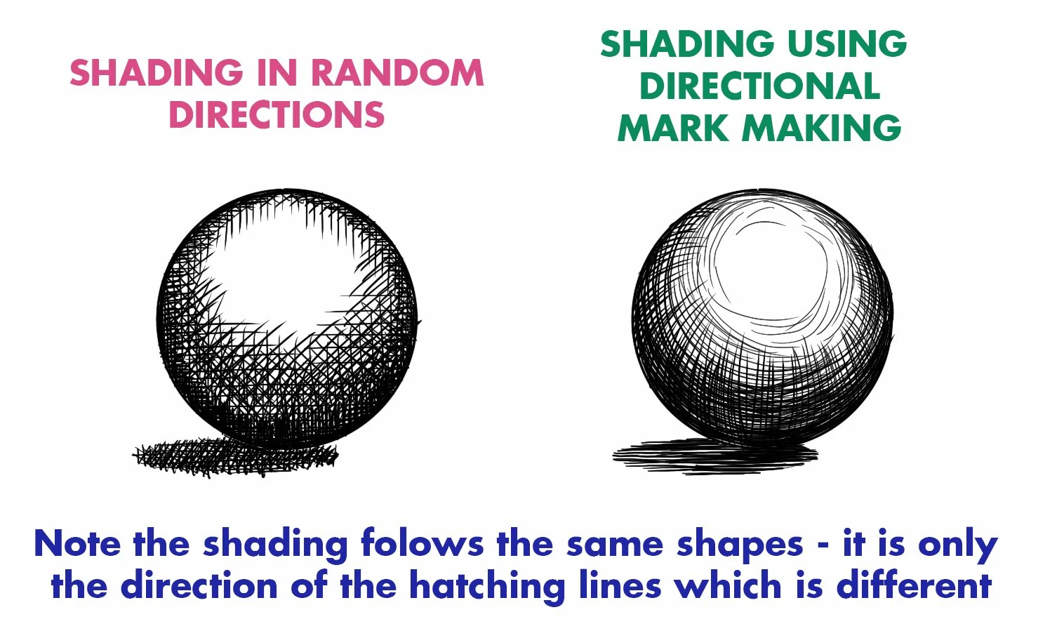
Imagine that our sphere is made from a frame, and that frame has horizontal and vertical bars on it. This frame can act as a template for how we should be directing our hatching lines, and if we do that, we will way more successfully communicate the object’s form.
The way this ‘wire frame’ on the sphere would look will depend on lots of factors - where the light is coming from, the perspective and perceived eye level within the image, and how close or far away we may appear to be from the object.
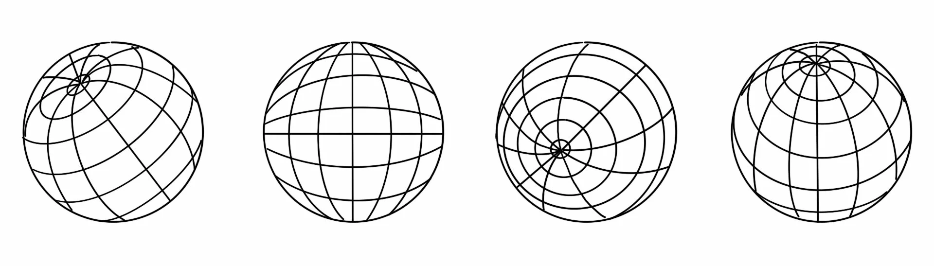
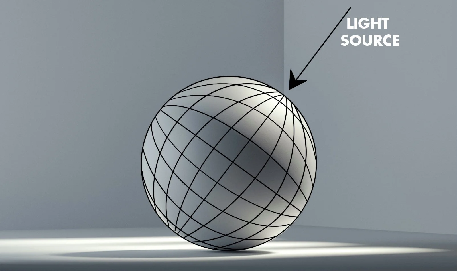
STEP 3: SKETCH A LIGHT PENCIL WIRE FRAME ON YOUR CIRCLE
In our reference image example, we appear to be very close to the sphere, with the light source coming from the top right. It can help to imagine the top of the wire frame (where all the wires join) tilting toward the light source, which means that when we come to draw our hatching lines, they will form roughly the right shapes to be able to convey the varying light levels, as well as the spherical form.
Our reference image also appears to place our eye level in close proximity to the sphere, so the horizontal and vertical centre lines will appear relatively straight, with the lines above and below (or to the left and right on the vertical axis) curving away from them.
TIP: It doesn’t matter how many horizontal and vertical lines you draw to your wireframe, or if they are evenly spaced - these are just going to give us the template structure to work to in order to help our shading lines go in the right direction.
STEP 2: SKETCH THE SHAPES OF THE MAIN SHADOWS AND HIGHLIGHTS
Once you have sketched a light pencil wireframe on your circle, now add the shapes of the various highlights and shadow you closely observed and made a map of earlier. Once you have both of these layers on your sphere, it will give you a really clear visual structure to help you get your shading lines going in the right direction.
Don’t forget to add the shadow under the sphere!

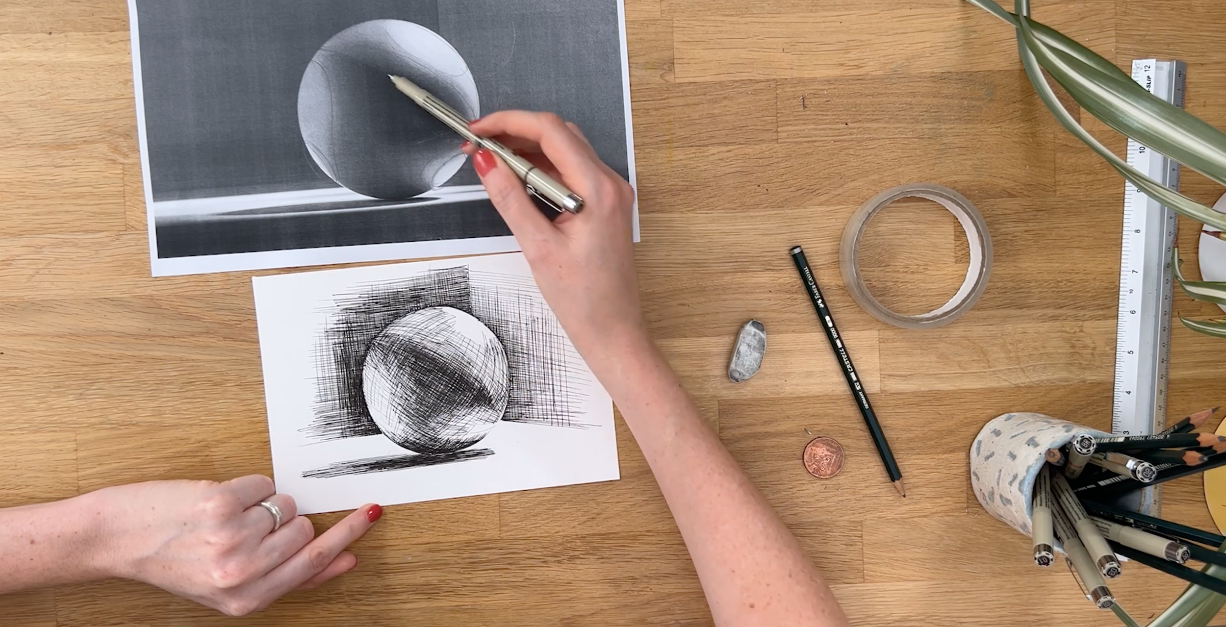
STEP 5: add first layer of shading
Start with the lighter areas first – the very lightest parts of the sphere we will leave with no shading at all, so next I’ll aim to create a really light shading effect by following my framework grid lines very lightly and gently with my pen everywhere except those very lightest areas.
We obviously have 2 choices here of which direction to go in whether we’re following the horizontal or vertical grid lines, and either of them will work but there is sometimes one direction which would be in some ways easier or more clearly describe the form of the object we’re drawing. If there doesn’t seem to be one way in particular, just pick one, it really doesn’t matter which one. For darker shadowy areas, you will be using both directions, but I would start with just one for the lighter areas.
Keep your lines light, and reasonably spaced apart at this stage too – of course the closer the lines are together it gives a darker effect which will suggest darker shadow, so they will get closer together nearer the edges of the sphere to help suggest that depth.
Remember that you can always build up more shadow, whereas you can’t remove it once you’ve inked it, so start gently.
TIP: One thing which is really really important when you’re approaching a drawing like this, is to not outline your circle in pen – this immediately flattens it, and we’re hoping to make it look really 3 dimensional by the way we shade it, so please avoid outlining.
Step 6: Add Further Layers Of Shading
Next look for the slightly darker areas, and introduce more shading, which is still following the grid structure, but now we can begin to use both directions, and the lines could also start getting closer together. Don’t go too dark at this stage because it will leave us nowhere to go – remember we can always add, but we can’t take away.
Keep working like this until you have got to the darkest shadowy parts of the sphere. Once you have inked this, you may need to go back to some of the lighter areas to add more directional shading lines in so that everything feels nice and smooth, and gradually blended without any harsh edges.
At this point, it can be helpful to erase some or all of your pencil marks so that you can more clearly see the effect you are creating, because they will be adding some additional shading to the paper. You should have enough directional shading drawn in by this point that you no longer need that framework too.

STEP 7: SHADE THE SHADOW UNDER THE BALL
This is another area where choosing the right direction of our hatching makes the world of difference! I often see beginners shading in all sorts of directions within shadows, and honestly, it can end up ruining an otherwise awesome drawing.
My best tip for shading with shadows, is to use mostly, if not all, horizontal lines. The reason shading shadows can be so tricky is that we need to have a really good grasp of the perspective going on in the image to get any other directional marks to feel ‘right’ whereas horizontal hatching lines will always, always look right for shadows under objects because they make the object feel grounded on the surface.
Be careful to pay close attention to the point where your object and it’s shadow meet – we need to really closely observe here because sometimes the light patterns here can be surprising.
Notice within this shadow that there is also a darker area, and a slightly lighter area too, so this should affect how closely together your hatching lines are. The other thing we can try to represent in our drawing is where the shadow is defined with a clear and harsher edge, and where it’s more blurred and subtle. Where it is more blurred, use slightly different lengths to your lines to create this effect, whereas the more defined clearer edge will have a more obvious edge to the shape.

STEP 8: SHADE THE BACKGROUND
This is another area, much like the shadow, that can really spoil an otherwise great drawing if you shade it in random directions.
In an image where you can’t see a horizon line denoting the edge of the table surface, I would always use vertical lines when shading a background, adding in some horizontal ones as well if you need to make it darker. In this image, we can actually see a corner, so there are 2 kind of planes to consider, which aren’t perfectly horizontal, so we can use both vertical lines, and lines which are parallell to the planes shown here. Bear in mind that the plane on the left is darker than the plane on the right, so your shading should reflect that.
Shading the background, even just a little – we don’t necessarily need to fill the page with shading – can be a great opportunity to make our sphere ‘pop’ and the area you want to focus on is the bit between the lightest part of the sphere and the background. Pay particular attention to the shading lines of the background there being in exactly the right spot to describe that curve, and remember, do not under any circumstances outline your sphere, it will totally ruin the shading effect!
STEP 9: REVIEW AND REFINE
Now you have all the main sections of shading completed, review your drawing and carefully continue to observe your reference photo, and keep adding and adjusting your shading to make sure you are happy with how it is all working together. Be patient with this phase - it does take quite a long time!
FINISHING
Once you are happy with your drawing, erase the pencil lines underneath and voila! I hope you enjoyed this drawing!
If you are taking part in Mindfultober and be in with a chance of winning a free year of Skillshare Premium membership, don’t forget to share your drawing on Instagram and tag both Shelley @shelleyskail and I @melrye on Instagram so that we can see your gorgeous art! You’ll also need to save the image below and re-post it when you share your art (it can be the second image!) and let us know in your image caption how you found the process - all the details can be found in this blog post.
